
If you’ve been designing websites for a while, it’s quite likely you know what a website card is and what it can do for your website design. For those of us not so sure what a website card is, it’s the rectangular boxes you see on websites that either have images or texts that serve as entry points to more information. I believe website cards are critical because:
- It grabs the attention of your visitors within a few seconds
- Leaves a visual impact
- Are a convenient way of displaying content
- They communicate quick stories
Not just that, I also believe cards are the future of the web. Consider popular sites like Pinterest, Flickr, Tunblr, Mashable and the like – their entire portal is built on the card layout.
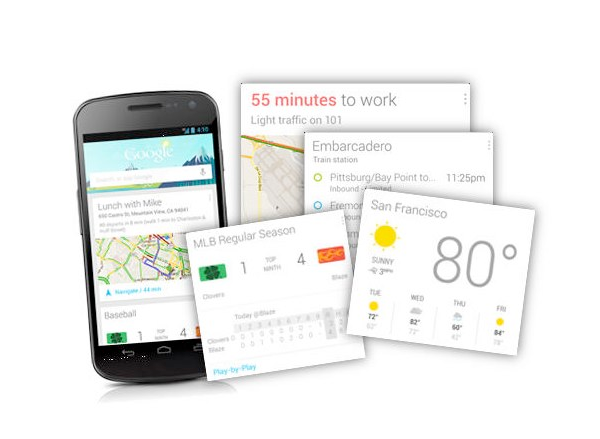
Google has moved to the cards UI.
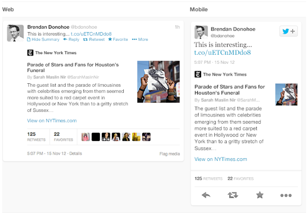
So has Twitter.
So how should you as a designer go about building cards?
Designing the Layout of Website Cards
There are 4 main elements that make a card what it is:
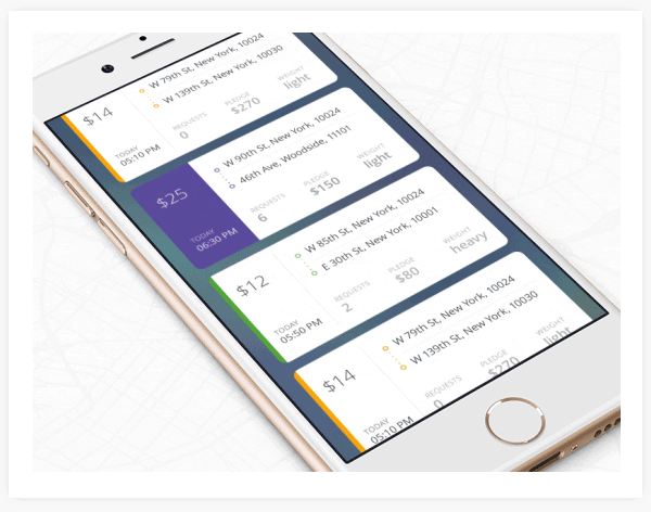
1) Height: Cards from a single layout should ideally have the same width to maintain consistency. However, the height of each card can differ depending on information you want to display. You can design it to temporarily expand.
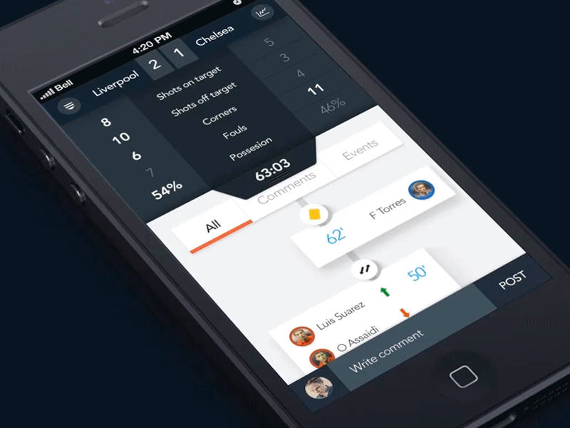
Cards are perfect for mobile designs or responsive websites. They can be stacked horizontally and can have variable heights.

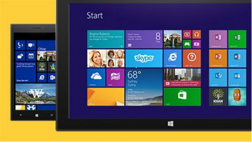
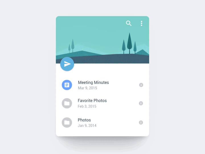
2) Style: Cards can be designed to give a certain feel to your website. For example, the Metro & Flat design by Microsoft.
Or pins for the social media type of site. Which allows for ‘social call-to-actions’ such as ‘Share’, ‘Like’ etc.
Or the classic style to keep it simple.
3) Animation: You can use animation especially on mobile responsive sites to improve UX.
Cards allow for interaction on your website / webpage with animation that allows a visitor to:
- Click for hidden buttons
- Scroll horizontally
- Expand a card for more information
- Refresh with a pull-down action
Interactive animations
Pull-down to refresh
‘Unlock’ hidden buttons
The unravel menu animation
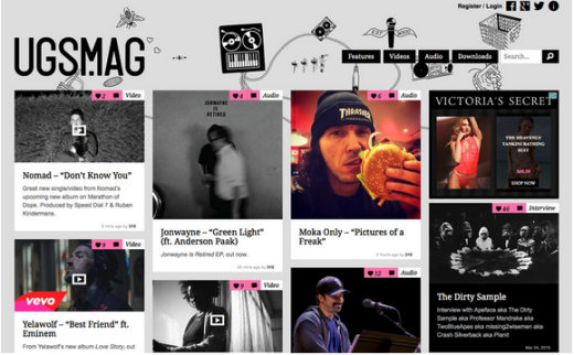
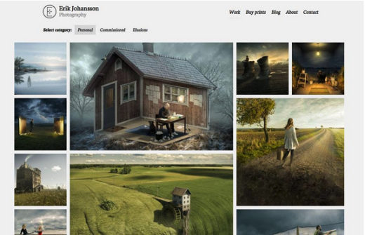
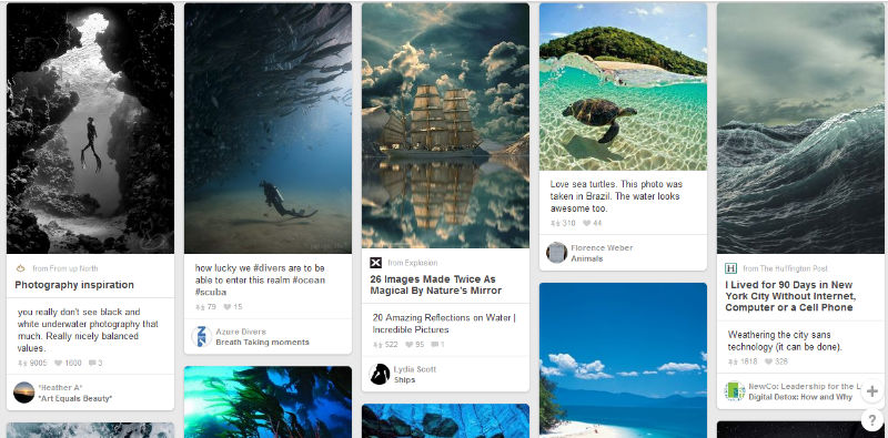
4) Image and typography: If you’re going to opt for the card design, make sure you pick a single, clear, crisp image and bold, readable text (if necessary) per card. Too much of either can make the design look cluttered. Pinterest is an example of good card design.
Advantages of Cards in Web Design
Cards, if designed well can lift the UX of the website you’re building for your client in just a few tweaks.
- Visually appealing: This is perhaps the biggest plus point of card designs. The idea of using images in a card-based design is definitely attractive to users.
- Perfect for responsive sites: Cards can be made to adjust according to your screen size smoothly which allows for a consistent UX across devices.
- Compiles content: With cards, you don’t have to worry about what information to give prominence to or how to get all what you want to communicate to your visitor out there. Cards are great to display the different content with information from various pages.
- Easy to Scan: With just a quick scroll, your visitor will be able scan your website and click on the content he’s interested in. The card style gives visitors freedom to browse and engage as they wish.
- Works with any design: Cards aren’t limited to a certain style of design. They work with flat designs, magazine-style design, minimalistic designs and more.
- Are Social: Cards allow and encourage social sharing. Their design supports easy sharing on social media platforms and even email. You can even design a ‘Share’ call-to-action on/ under the card.
Cards layouts have been at the top of design trends this year and don’t look like they’re going away anytime soon. Design modern, user rich experiences with this layout and move your design style to edgy and stylish.


