
Responsive is definitely the new way forward but with every new device comes challenges like resolutions, layouts, screens. And while we’re fairly sure you’ve found the tools that enable you to build these, we believe Google’s latest is a fantastic pre-building testing tool that you absolutely need! For all you web designers & developers, going responsive just got a whole lot easier.
What is Resizer?
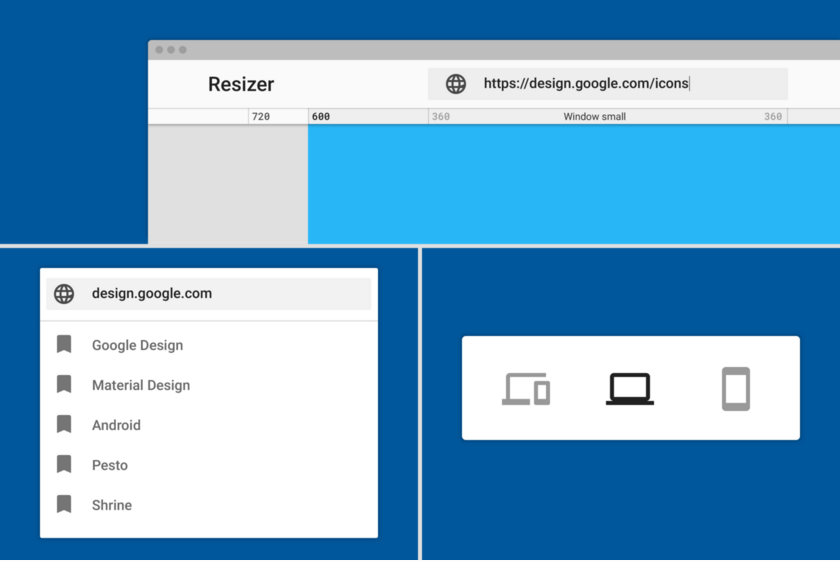
Resizer is a superbly useful, highly intuitive & efficient tool for testing any URL (for responsive building) in seconds. It enables you as a developer to figure out the right UL to serve by allowing you to test material design across various devices.
What’s the advantage with this tool?
- It helps you identify breakpoints
- Displays how your site looks on various devices within seconds
- Mimics the actual performance (Clickable links and everything)
- Fully interactive
- Transitions are spot-on
- Saves you a ton of time & work
- Super tool for testing
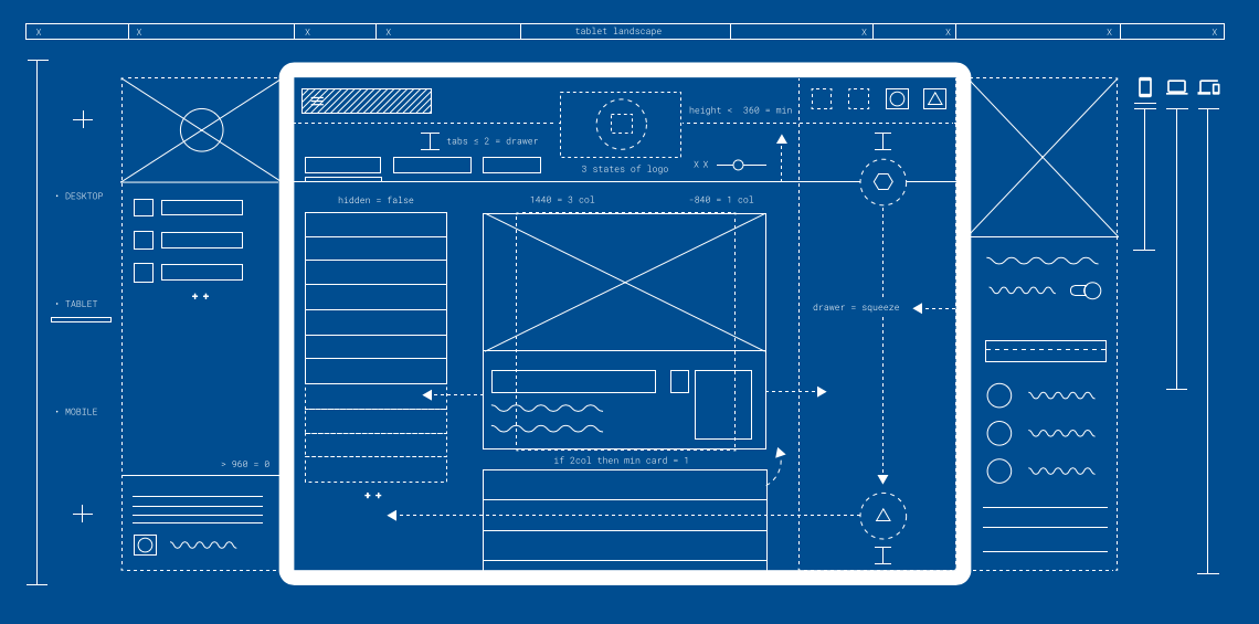
Resizer gives you a dynamic way to test Material Design guidelines that Google first introduced around breakpoints, surface behaviours, user interface patterns, responsive grids etc.
The tool is especially useful to showcase to clients & facilitate conversations between clients & developers & designers about responsive UI & various patterns.
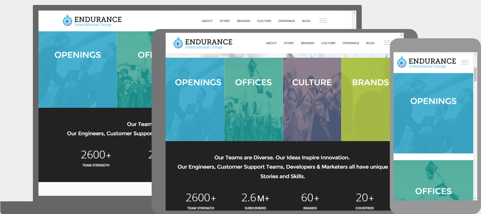
We tried it with our ResellerClub website & in seconds, we were able to get a visual feel of what our website on various devices.
We recommend giving Resizer a shot. It’s a great visually dynamic resource to enable you to build faster & smarter. Go ahead and try the tool for your website here.
Reseller Club Hosting Services
Reseller Hosting | Windows Reseller Hosting | Cloud Hosting | VPS Hosting | Managed VPS Hosting | Dedicated Server Hosting | Windows Dedicated Server | Managed Dedicated Server | Linux Shared Hosting | Windows Shared Hosting


