
Design is about communication. As a designer, you’ve achieved what you set out for if your visitor finds what he’s looking for on your website with ease. In a couple of my earlier blog posts, I’ve covered how to use calls-to-action in your web design but icons? Icons can also be calls-to-action but can be effective visual replacements for text.
Icons are usually instantly recognizable and already have strong, defined concepts and although they may only be a small part of your website, a failure to nail it, can make your design look tacky and cheap.
What separates icons from other images are the fact that icons are universally recognisable and can convey the action without words. Take my icon test with these below and shout out what they represent. Let’s see if you can do it under 5 seconds:
![]()
If you said washroom, right answer! Next one..
![]()
Did I hear you say ‘Danger’? Bravo!
![]()
‘No left turn’? You got it.
![]()
Did you say ‘Download’?
![]()
‘No photography’ is correct!
Why was it so simple to identify them? It’s because theses icons have become associated with action or meaning repeatedly and universally.
Guidelines to Designing Your Own Icons
I like how Joel Diaz pens his process of designing an icon to outline 5 Guidelines for Designing Better Icons. He talks about 5 important things to keep in mind:
- Understand the Problem
- Take a Holistic Approach
- Appreciate That Simple is Better
- Consider Context
- Understand Semiotics
1) Understanding the problem: He talks of how the request from his client was to create an icon for a document loading error something like this:
![]()
Joel suggested stripping it back. To make it:
![]()
This icon didn’t give any reference and so wasn’t easily understood.
2) Take a holistic approach: After toying with the icon, this came up.
![]()
This however, as they realised, was also used as a clinical icon. The danger of reusing an icon that is already used to represent something is what you want to avoid. It’s important to have an understanding of a set of icons.
I suggest doing this by reading material and doing your own research. Run your icon designs past a group of people to see if they get it.
3) Appreciate that simple is better: Joel’s client then suggested this one:
![]()
This was far too complex and the metaphor was confusing.
4) Consider context: They then considered this:
![]()
This one communicated ‘danger’ because of the bright colour and bold icon. Light colours like greys and pastels sub-communicate that the problem isn’t very big and things will be fine. A red, big, flashing icon would problem set you off in panic mode as if the issue is already more serious that it really is.
5) Understanding Semiotics: Joel notes that sub-communication is a semiotic language, also important and present in typography. You can have a feminine font, a delicate font and so on (our ‘What the Font‘ blog tells you all about this).
Ask yourself what your icon is going to communicate.
Joel points out Internet downtime icons like these:
![]()
![]()
What’s perfect about these icons is the small size, the subtle message that conveys something is wrong and yet a light icon colour indicating a it’s not serious.
Joel and his client eventually settled on this (quite apt) design for a document load error:
![]()
More best practices to keep in mind:
- Keep it classy and simple
- Avoid overloading your design with icons
- Stick to the overall website design theme even for icons
Advantages of Icons
Icons are a great way to:
1) Make listicles look interesting
![]()
2) Increase readability and break the monotony of text
![]()
3) Throw in some personality & fun
![]()
4) Make headers out of icons
![]()
The Icon Bank
We know great icons are the Internet’s gift to web designers or just Webydo‘s gift to designers. This site gives you a bunch of free icons that are great for every type of design. Here are a few:
Multipurpose Icon Set
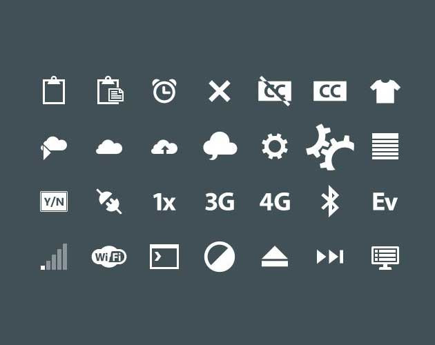
WorldWide Web Icon Set
![]()
MiniCool Icon Set
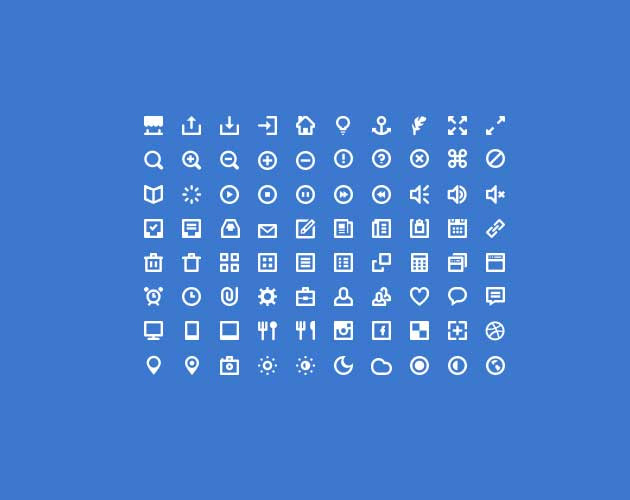
You can explore all the sets here.
If you’re looking for something even better, try IconFinder, the world’s largest collection of premium icons to fit your project perfectly. IconFinder provides millions of designers and developers with over 1 million current icons and over 50,000 new icons added every month. We have a special offer of 50% off on this fantastic design resource. If you’re interested, head over to the page.
Go on, make your designs stand out with well designed, wisely picked icons.
Reseller Club Hosting Services
Reseller Hosting | Windows Reseller Hosting | Cloud Hosting | VPS Hosting | Managed VPS Hosting | Dedicated Server Hosting | Windows Dedicated Server | Managed Dedicated Server | Linux Shared Hosting | Windows Shared Hosting


