
The objective of designing is not just to make the website or the paper look good but to successfully portray what the brand is to the target audience, visually. This also includes minimum amount of effort on part of the designer and maximum amount of result, which gets us to today’s topic, “Minimalism”.
Minimalism is a concept which helps you to successfully draft a message for your audience by using minimum elements and efforts and yet helps in evoking stimulus.
Many of today’s designs such as flat design, large background images etc have come up from the concept of minimalism. Minimalism is a web design movement which began in the early 2000’s and has been adopted by designers ever since.
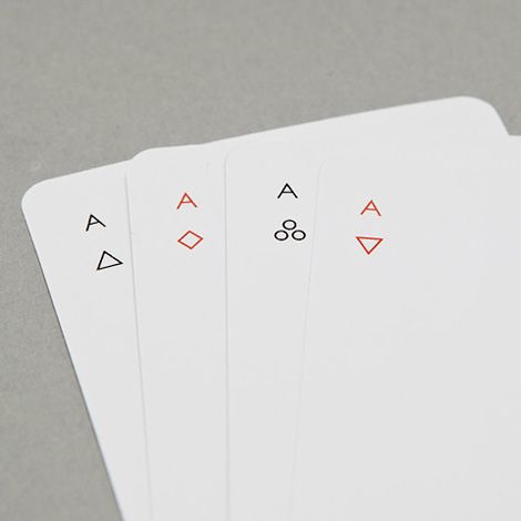
Minimalism is about an attempt made to compute and prioritize content over the chrome, and if done correctly, it can help simplify your task and focus more on your design. There have been misconceptions about minimalism amongst web designers because of which they try and cut the important information, which then kills the entire purpose of minimalism. This leads to increasing the complexity rather than reducing it.
In order to understand minimalism better and apply it more effectively, we need to understand its origin and its characteristics.
First things first, what is a minimalistic interface?
The main aim of minimalistic web design is to present content in a way that it is simple to understand. This can be achieved by concentrating more on the core content. It tries to simplify interfaces by removing the unnecessary elements that does not support users task. Minimalistic interface includes limited color palettes, flat textures and also the use of negative space. Minimalism is basically a reaction to the “maximalist” user interface.
Rise of Minimalism
Before minimalism became a web design trend, it was an art movement in the time frame which followed the World War II. It then emerged because of the chaotic colors and motions which were often found in abstract art work. In the 1960s minimalism gained popularity and was used in different fields like architecture and fine arts.
Minimalism was also adopted by the pop culture and hey worked very well for the movie business and later posters started coming up which started depicting the meaning of the movie and what it included.
Graphic designer such as Josef Müller-Brockmann, painter Ellsworth Kelly, and industrial designer Dieter Rams and many more have adopted minimalism in their works.
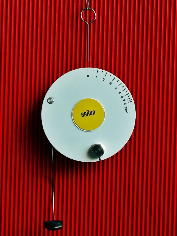
Tonarmwaage, 1962, a design by Diete r Rams.
“Less is more” is the motto which clearly depicts the perspective behind minimalistic art which was put forth by the famous 20th century architect, Ludwig Mies van der Rohe. This motto later became a trend amongst web designers who used fewer elements on a page.
Later, at the end of the 20th century, the concept of data-ink ratio came up. Data-ink ratio is basically the ratio between the ink used to convey the information and the total ink used to print the graphic.
In the beginning of the year 2000, minimalism was adopted by many and the use of negative space, less content and confined color palettes.
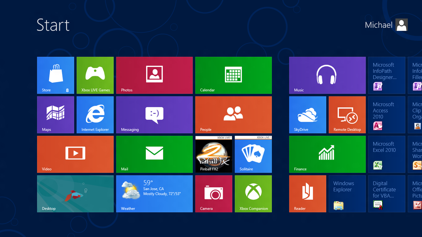
Later in the year 2011, Microsoft came up with Windows 8 which was the first major redesign in the operating system in decades followed by Apple revamping iOS with a much flatter and minimalistic design.
The trend has been going on ever since.
White Space and its beauty in minimalism
White space, also referred to as negative space is a portion of the page which is left unmarked. This term has been derived from graphic design practice, where the printing process is generally done on white paper. White space is an important concept in minimalism, since it enables the user to concentrate thoroughly on the content without getting distracted. The use of white space or the negative space is the key to aesthetic composition.
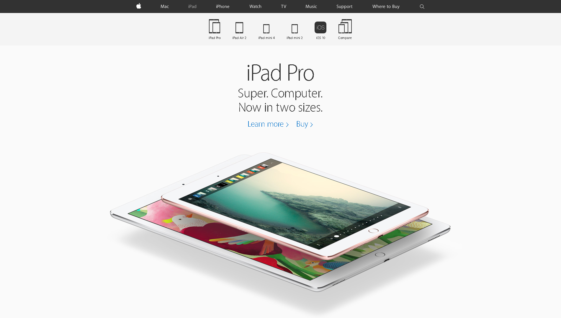
Content can get very brief when it comes to a minimalist layouts or can even have lengthy and detailed concept. Apple’s website design is made by adopting the minimalist interface approach where you will see the use of white space a lot. This helps the user to focus just on the content and on the image, keeping any kind of disturbance away from the user’s vision. Aesthetic white space also plays a strong role in single-page layouts. All of the website’s content can be found on the homepage, so the design uses extra white space to cultivate distance.
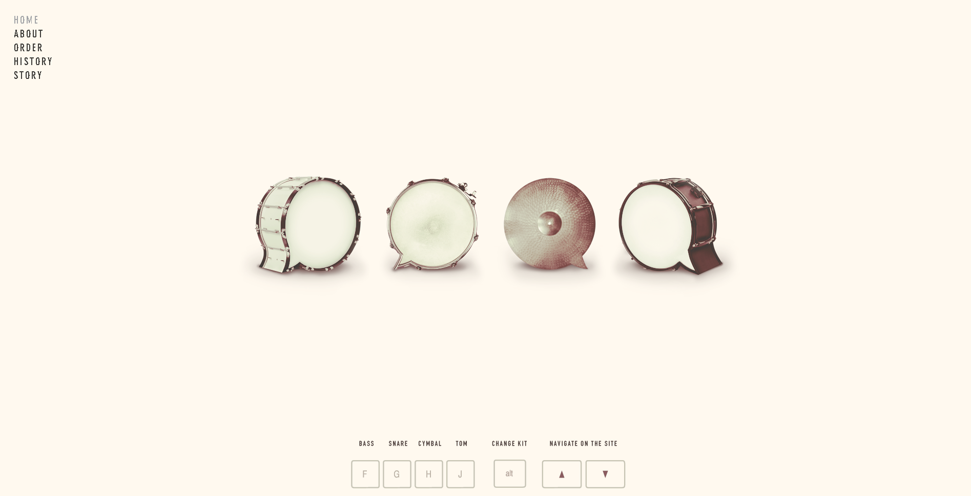
Source: Beatbox Academy
The landing page of Beatbox Academy has minimalist design qualities. From the kind of typography used, to the images and even the navigation button, are perfectly put out against the plain background, using the concept of white space.
Tips for incorporating a successful minimalist interface

You must consider if the minimalist approach is the right kind of approach for your website and business. Conduct a thorough research before adopting this approach. If you finalise on using the minimalist approach, you must keep the following things in mind:
- Always remember that “Less is more” and don’t try and add elements which are not required, be it for content, visual design or feature decisions.
- Think about what the customers of your clients think of the brand and product and make sure to incorporate these aspects in your minimalistic design to convey the message loud and clear.
- Have a dramatic typography so that equal emphasis is added to the content of the website and more users are attracted to the kind of content you put up.
Along with creating minimalist design for the website, make sure you pay an equal amount of attention to the navigation options. Navigation options are something that are ignored by most because the whole idea of minimalism revolves around designing. In order to make it more attractive and making the user experience easy, one must make sure that the navigation button also gets a minimalist makeover.
Let’s take an example :
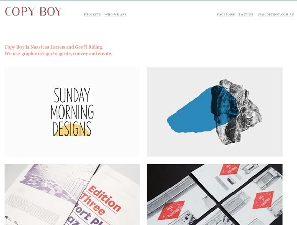
Copy Boy has incorporated minimalism in their navigation which makes it very easy for the user to navigate through the page.
And finally, why should you incorporate minimalism?
- Minimalism forces you to polish your message and convey it better to the users. It helps to cut down on content and visuals which are add ons and can distract users from the main content. Every element on the web page becomes more deliberate and very element helps to serve a purpose.
- Since the amount of clutter on your web page reduces because of minimalism, it helps you convey your USP much better. It conveys what exactly you or your brand does, keeping confusion away.
- Your customers get breathing space because of the negative space on your website. It does not make the customers feel rushed to the next page and gives them the time to take in whatever you have to serve them.
Most of what I’ve written above, comes under good design principles, but these often get skipped due to the time constraints or due to favor of convenience. Minimalisms encourages you to take conscious designing decision and will make you question the existence and use of each element and each source on your page.
Just make sure that minimalism is the right choice for your company and your product and make concise decisions and you’re good to go.
Reseller Club Hosting Services
Reseller Hosting | Windows Reseller Hosting | Cloud Hosting | VPS Hosting | Managed VPS Hosting | Dedicated Server Hosting | Windows Dedicated Server | Managed Dedicated Server | Linux Shared Hosting | Windows Shared Hosting


