
Scrolls… you probably don’t even think about them too much. For a long time, scrolls have been dismissed as just a basic functionality to move up and down on a webpage that is more than your screen size. Today, web designers are exploring all that can be done with scrolls. And there’s one definite conclusion – there’s more.
Clever coding with the scroll can enable you to create amazing animations and therefore, amazing web designs for your client. Advances in JavaScript/HTML 5 have made this possible.
But, is there a need to redesign the scroll? Definitely, yes.
Why the scroll needs to be redesigned
- Scrolling has become easier with touch screen devices, especially mobile devices
- It’s also become acceptable by users given the various small devices in use today – smartphones, tablets
- 3D touch allows for zooming in on screen, pinch for menus, pull down for refresh etc. that parallax scrolling is perfect for
- Fast bandwidths allow for fast load and therefore more elements on the page
- Traditional scroll designs are limited to simple viewing of the page top to bottom
- Advances in technology allow for parallax type scrolling
Let’s take a look at what the scroll is really capable of:
The Types of Scrolling
1) The Parallax: Parallax scrolling is a fairly recent and one of the most popular trends which involves the background moving at a slower rate than the foreground, creating a 3D effect and an illusion of depth, creating remarkable effects. The word ‘parallax’ first came about from the visual effect of 2D side scrolling video games which used different backgrounds and movement speeds.
Advantages of Parallax
- Wows your website visitors
- Can use story-telling approach to educate your visitors about your product / business
- Directs visitors to the calls-to-action
- Allows for interaction and promotes curiosity
- Could reinforce credibility with innovative, interactive UX
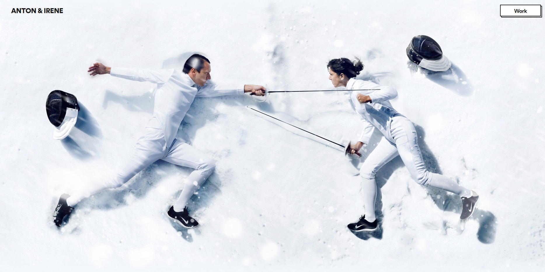
Here’s an example of Parallax scrolling that I particularly like.
Awwards lists out the 30 best websites with parallax scrolling here.
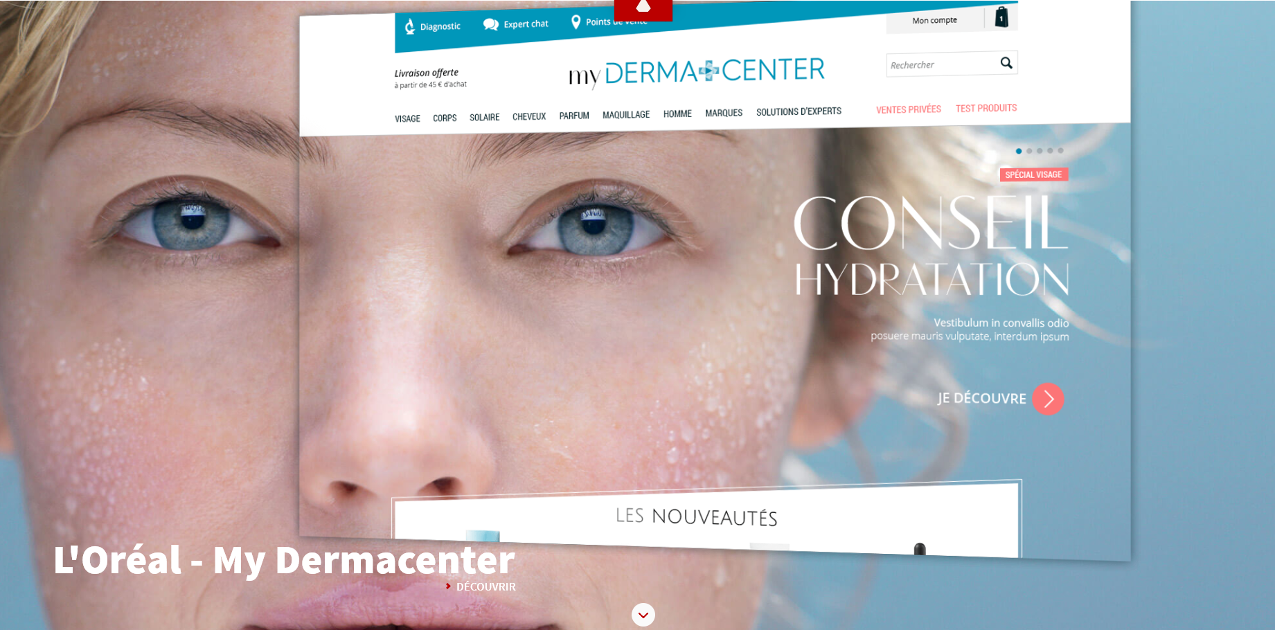
2) Screen as Page: Screen-as-page scrolling is a type of parallax scroll that allows visitors to perceive your screen as pages. Each screen can be made different ‘pages’ by adding different backgrounds, different colours, styles, typography and even different calls-to-action.
Advantages of Screen-as-Page scrolling
- Breaks the monotony of scrolling
- Can completely change elements of an otherwise monotonous website
- Encourages interaction
- Can display different bits of content / information on each “screen”
- Doesn’t overload the senses
Superlime is a fantastic example of Screen-as-page scrolling.
3) Animation Scrolling: Animations are a fantastic way to turn any website fun and interactive and thankfully, scrolls enable that kind of animation.
Animation by itself captures the visitor’s attention but animation that depends on the visitor’s interaction with your website (through a simple functionality like the scroll), is a plus point.
Advantages of Animation Scroll
- It’s interactive
- Keeps your visitor on your website for longer
- Can make your brand unique, innovative and fun
- Involves your visitor therefore creates greater brand recall, excitement and consequently encourages visitors to share your website
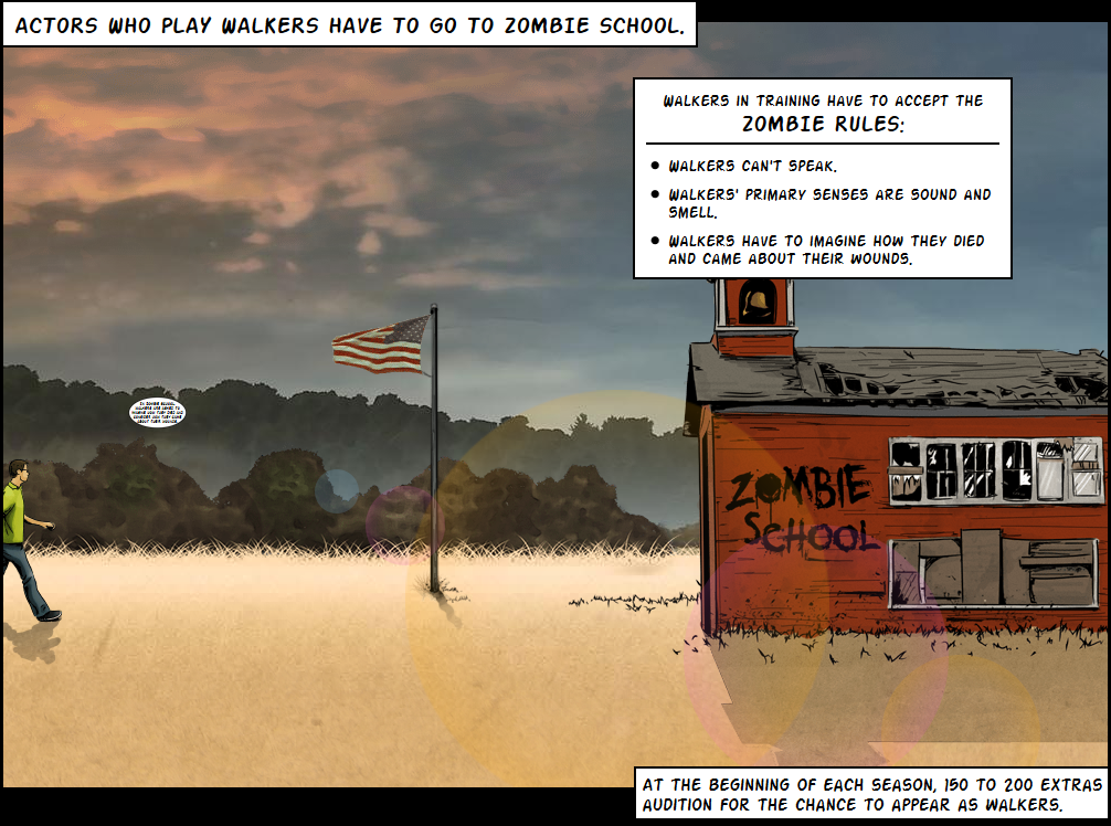
The Walking Dead‘s website has amazing animation scroll. We bet you can’t stop scrolling once you start.
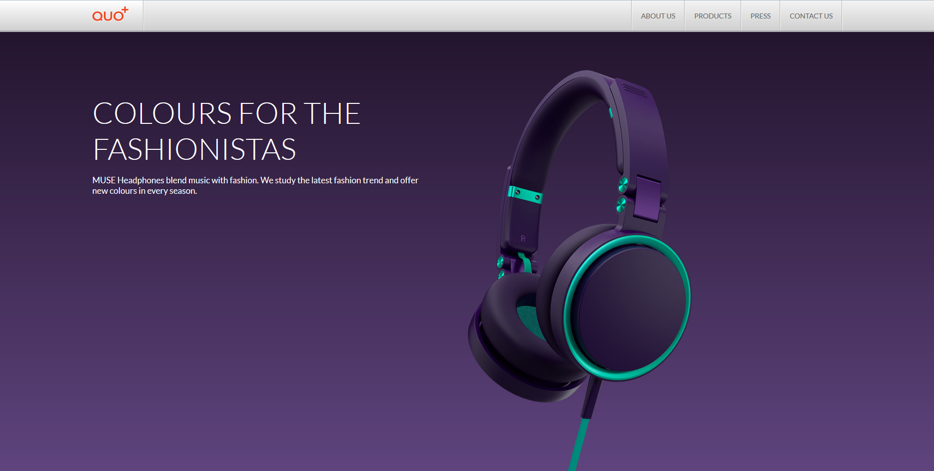
4) Filter/ Colour Scrolls: This is a type of scrolling that gives the perception of changing colours as you scroll. This is an ingenious way displaying the different colours of your product without a catalog.
Advantages of Colour Scroll
- Creates different effects
- Minimizes the need for multiple web pages to showcase various colours of the same products
- If designed well, they can be clean and clutter-free
QUO+ uses this type of scroll extremely effectively.
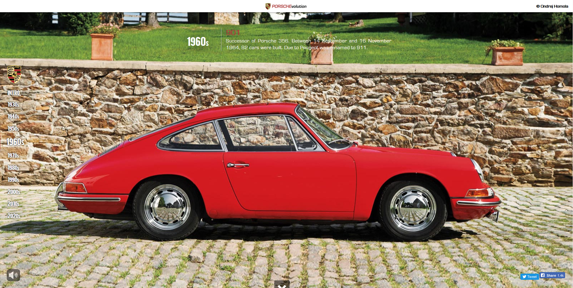
Porsche is another great example of colour scroll that brilliantly uses the innovation to not just showcase the colours of the product or the type of products but seamlessly tells the story of the evolution of Porsche.
Some Best Practices to Follow
As a web designer, you don’t want to over-do anything. The trick to great designs is to use just enough of any design element without it being overpowering. Likewise with scrolling. Too much of it can ruin your design but lucky for you, we’ve got you covered. Here are some best practices to follow to make sure you nail it:
- Beware of too much: Too many screens can make your design look cluttered and may disrupt the follow. Innovation in a small, subtle way can also make a big difference to your design. Just because parallax is a trend, doesn’t mean your design needs to be packed with it.
- Guide your visitor: Sometimes, as designers, we get so caught up with our innovations, we often forget that our layman visitor may not even know what to do once he lands on your page. A visual cue such as a ‘Scroll here’ or a path to show the user his position on your website can be useful to guide him through.
- Avoid infinite scrolling: We get that scrolling is a great new way to engage your visitor but too much of scrolling can get your visitor bored especially if he’s scrolled enough and still hasn’t found the information he’s looking for.
- Choose Sticky navigation: Navigation or buttons that remain on the screen throughout while the rest of the content moves are a good idea to have mainly because your visitor can easily click on the button to go back to a page without having to scroll back up all the way.
We hope you go out there and create amazing web designs with scroll! Not only will this impress your client, it will also invite more visitors to his website just for the sheer innovation of the scroll! We’d love to see your designs! Comment and let us know if you have any suggestions, tips or need more information! And I thought I’d reward you for scrolling all the way to the end of this blog so just for laughs, this website scroll always cracks us up 😀


