
Designing a website is a mammoth task, right from selecting the theme, plugins, layout, and content. There is this popular saying that goes “Content is King” and it holds true even with your website. Not only is the quality of content very important but also its placement. This is what we will be covering in our post today, how to merge design and content to get a professional looking website. To get started let’s get to know more about content.
What is Content?
Content is the foundation of the web – it is what you as the owner of a website want to tell your audience – it is the essence of your brand or your person – content is who you are. It is also one of the key reasons why people browse through various web pages full of topics and ideas every day.
As per the Content Matrix, these are 4 purposes of content Entertain, Educate, Inspire and Convince the readers. Any website you visit follows at least two of these. Content is broadly classified into 2 types:
1. Text Content
2. Media Content
Text Content:
Text Content as the name states is textual data written on the website. This includes text on the background, as well as the text on the images uploaded. Good text content is one that is original, well-suited for the website it is being written for and simple. Content that is both simple and engaging keeps the audience coming back for more.
Media Content:
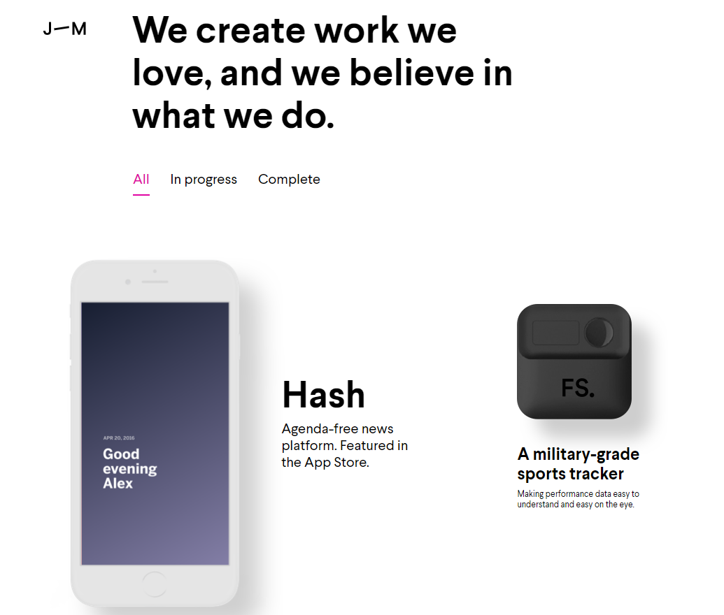
Media Content covers Images, Audio, Video, and any animation. Media content is usually secondary to text and is always included in moderation. This is true for all websites apart from the ones that are animation or video specific. In such websites, the text data is kept at a minimum to balance the web design. One of the most commonly used media content is images and their proper placement is very important.
Importance of a Minimalistic approach:
Minimalist design is a concept which helps you to successfully design a web page by using minimum elements both content and media and yet helps in evoking impetus of your website.
Here are 4 reasons to adopt the Minimalistic approach:
- The most significant advantage of incorporating a minimalistic approach is that it increases the aesthetic value of your web page making readers /customers feel peaceful.
- The focus is on the main message, which makes the website look crisp and professional with no clutter.
- Customers don’t feel cheated, as the web page doesn’t make any false promises, but is honest to the core.
- Products on your website become more self-explanatory and no additional content is required.
How to Place the Content
“A good advertisement is one which sells the product without drawing attention to itself” quoted David Ogilvy, better known as “the father of advertising”. The right image with proper placement of content is what breathes life into your web page and hooks the customers to not rush through but read it. To understand this better, let’s look at David Ogilvy’s 5-Step Formula.
5-Step Formula of David Ogilvy follows the following sequence:
- Visual
- Caption
- Headline
- Copy
- Signature
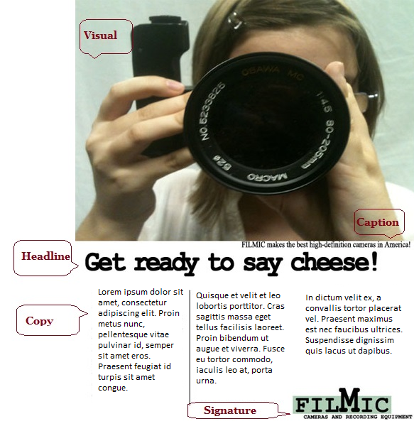
Let’s elaborate on each point, to understand it better:
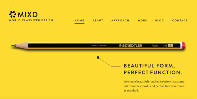
- Visual:
The visuals i.e image representations should always be placed at the top of the page. It should be relevant to the post and capture the reader, for maximum impact. - Caption:
Always give a small description of the photo, below the image. - Headline:
A great headline is one that is catchy. Be it a landing page or a product specific page a headline goes a long way to grab the customer’s interest. There is no rule, that a short headline is catchy while a long one boring. As long as it arouses interest, is simple to understand and gives relevant information the headline is perfect. - Copy:
The copy is a very important aspect when it comes to crafting the content on the web page. It should be in sync with the product image as well as contain relevant information in a precise manner.One idea is to ‘drop cap’ i.e emphasize the first alphabet of the first word, to draw the attention of your customer to read the text. ‘
- Signature:
The final segment of the page is the Signature. Signature is your contact information and the best place to put it is on the lower right corner, at the far end of the page. This is so because this is the last place the customer notices (it at all) before going to the next page of the website.
Advantage of Organizing Content Properly
Now that we’ve seen how to arrange the content on the website for improved customer engagement, it is now time to look at the advantages it offers.
- Less is More:
“Less is More” is a well-known phrase when it comes to minimalism. One of the key advantages of this approach is that it limits the quantity of the content on your web page. Also, it gives the design a breathing space, cutting all unnecessary features. - Responsive Design:
A responsive design is the one, that is self-adjustable depending on the device it’s been accessed on. The quality of your website doesn’t change irrespective of viewing it on tablet or desktop computer. If you arrange your content in accordance with the design making your design look responsive is an easy task. Also, your website looks professional, impressing t>e potential customer. - Focus is not just on the design but also on the content
Balance is very essential when it comes to designing your website. Your website might be a product specific one, for example, hosting on such a web page it is essential that the design (image or banner) doesn’t overshadow the content. This is so because the content is of importance here, it talks about plans and packages and so on. One example is ResellerClub’s website, here as we can see the emphasis is on the text despite there being a banner. - Website is not cluttered
Earlier websites used to cram a lot of content on one single page thereby, leaving the reader confused. Bombarding too much content doesn’t mean your reader will read through all. It could even backfire and the potential customer might never return because he couldn’t find data relevant to him. Try not to bombard your readers with too much text, as it can turn the web page dull instead of informative.Here, is an example of eBay website back in the 90s and a modern balanced website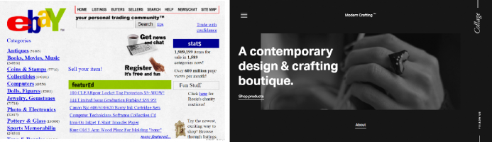
Majority of what I’ve covered in the above post is a part of good design practice although many times it gets sidelined. When designing a website it is very important to give equal focus to both the content and design, and remember that one is not above the other. Each has a part to play and effective utilization of both the resources can transform your web page.
What’s the wait, get started on your website with these tips and it will surely be a treat to your visitors. Leave a comment for us, if this approach helped you.


