
Blast from the Past
For years, whitespace in design has been branded as ‘too plain’ or ‘lack of design’ and is even called negative space and something to avoid. This trend of thought was so common in web design, that even the best of the best brands crammed everything in design to avoid whitespace. Take a look at Apple’s website from the 90’s.
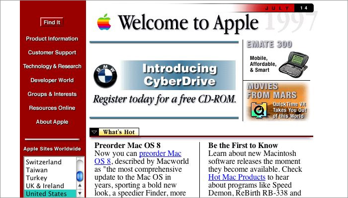
Web design in the early days including filling up negative space with gifs, table layouts to organise content, text, animated text, page hit counters etc.
With the early 2000s, came increased CSS support that allowed separation of content and design. This made website maintenance easier due to reduced complexity, quicker load speeds, greater flexibility and gave room for content to be developed independent of design.
The understanding of white space grew. Garish, neon buttons were replaced with blending colours, icons replaced text, resolution and pixelation were concerns, and placement of content grew. It was the budding era of minimalism.
Difference between Minimalism and White space
Come late 2000’s, designs became sleek, intuitive and clean. Today, along with minimalism has come the understanding of whitespace and the importance of it in web design. While there is an overlap of what minimalism and whitespace is, I think the difference, between the two simply put, is that minimalism is the focus on the hero element with use of an outline or minimum detail while white space is the important (and in most cases, background) space that enhances the hero element.
Let’s take an example:
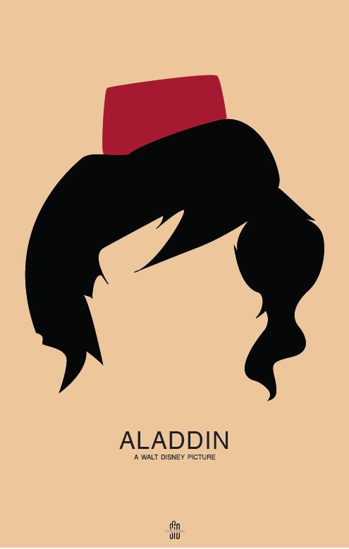
In this poster, we can clearly conclude that it’s minimalistic design, the hero element being the Aladdin outline while the negative space, enhances the hero image to make it stand out. Our earlier blog on Minimalism tells you how to incorporate minimalism in design.
Importance of White space
As you can tell from the Aladdin example above, white space is important to make the hero element stand out but there are other purposes white space serves:
- Create balance: From the examples of designs from the earlier years, one thing was clear – clutter. The animations, multiple colours, gifs, all contribute to clutter and whitespace breaks that clutter. A clean image with minimal text creates balance and is pleasant to look at.
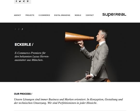
Brand example: superReal
- Be classy: White spaces adds an air of luxury and sophistication to designs. This is because minimalism has become synonymous with elegance. Heavy whitespace is often used for a high-end brand since the product speaks for itself while a crowded, crammed website gives off the impression of being cheap.
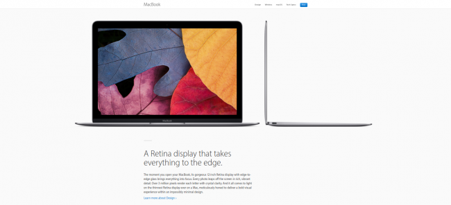
Brand example: Apple
Apple is confident that the product speaks for itself and it truly does. The white space beckons you to take in the product and nothing else.
- Draw focus to your product/ feature: Negative space helps the hero element stand out, as we’ve seen before. It also helps focus only on the feature or product that you want.
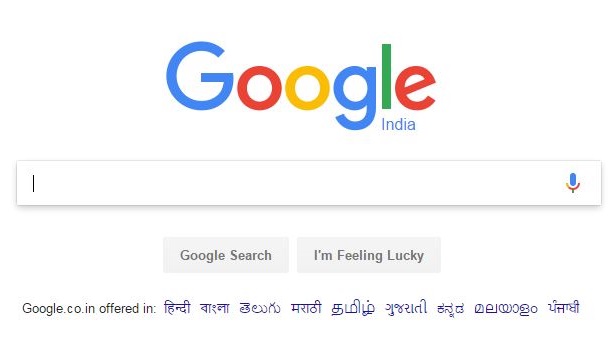
Brand example: Google
I mean, is there anything you could do here but search?
- Pleasant user experience: Clutter creates confusion and often distracts the user from the main goal of purchase or sign up or subscribe. Additionally, white space is a great separator for lengthy text which can make it difficult to read.
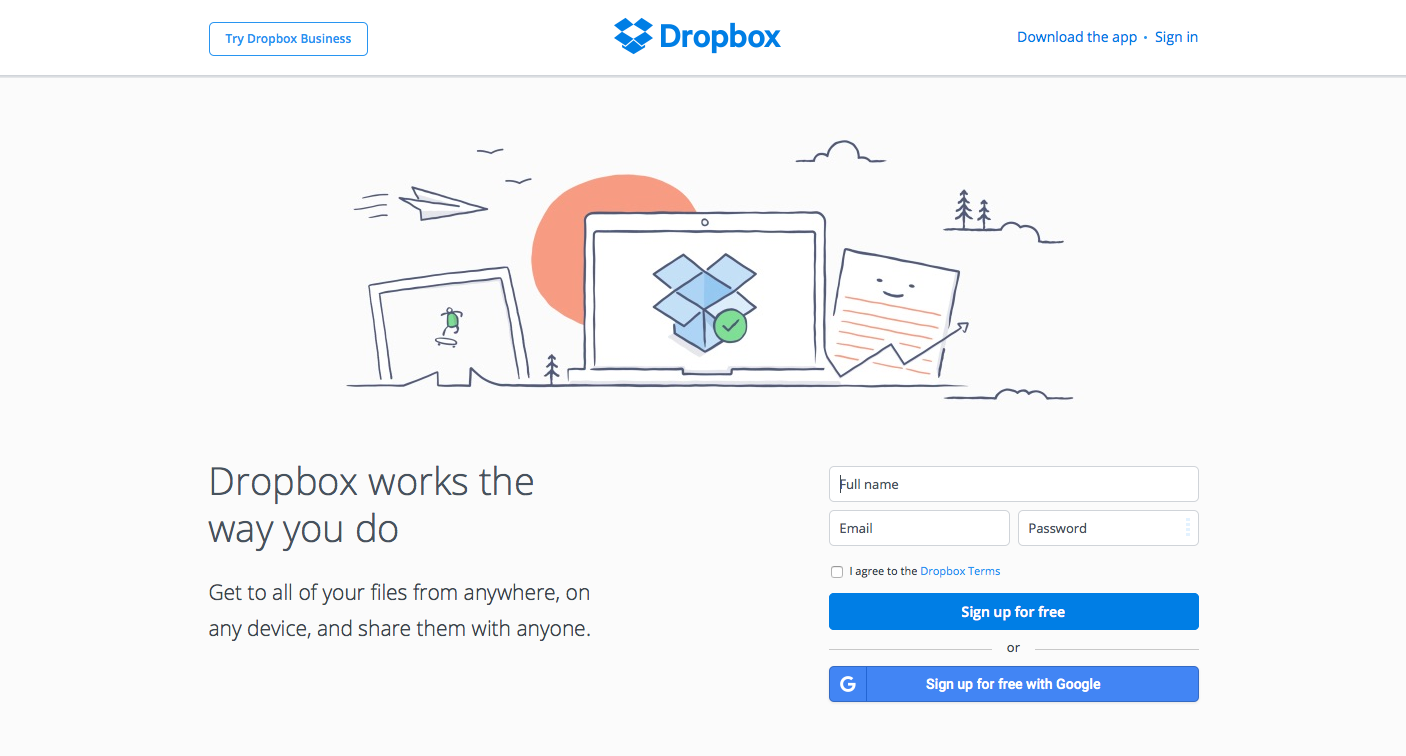
Brand example: Dropbox
The child-like illustrations and white space combined calms a technophobe and gives an laid-back effect, making it a pleasant experience for the user.
- Convey professionalism & credibility: Because white space conveys sophistication and luxury, trust and credibility follow.
Additionally, white space in design creates a sense of professionalism. An investment in good design conveys that the brand is serious and that the user matters.
Clutter, on the other hand, makes the design look like an amateur designer could’ve created it.
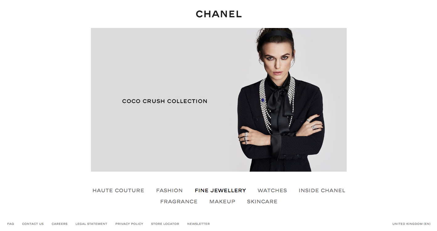
Brand example: Chanel
Although ‘coco’ and ‘crush’ are colloquial words, it’s the use of white space, the positioning of the menu and the font that gives it an air of professionalism and credibility.
- Draw attention to important information: Important information could be your products which can be multiple. So, how do you display and draw attention to multiple items without seeming crowded?
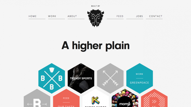
Brand example: Built by Buffalo
Built by Buffalo displays multiple items without seeming crowded due to the clutter-breaking white space surrounding the design.
- High recall to CTAs: Sometimes, the most obvious way to make things stand out, is by making it bigger. However, surrounding white space can be just as effective.
Brand example: Attitude Design
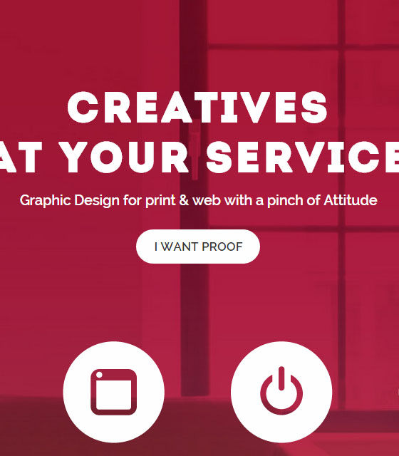
Strong calls-to-action combined with enough white space makes you want to click on an option. Try it out, you’d be hooked at least for a couple of minutes.
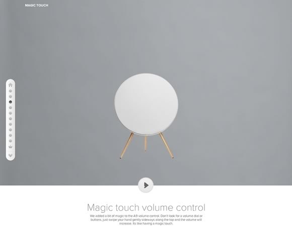
- Increased interaction: White space increases interaction by decreasing the amount of distraction especially when users are skimming through a site. According to research conducted by Human Factors International, whitespace increases comprehension by almost 20%.
Brand example: Beoplay
Conclusion
White space is important in web design and can convey a lot. It’s a designer’s invisible weapon which enhances everything around it. I like to think of white space as the behind-the-scenes crew putting the theater artist in the spotlight – the applause is for the hero but it’s the crew who pulled it all together.
Reseller Club Hosting Services
Reseller Hosting | Windows Reseller Hosting | Cloud Hosting | VPS Hosting | Managed VPS Hosting | Dedicated Server Hosting | Windows Dedicated Server | Managed Dedicated Server | Linux Shared Hosting | Windows Shared Hosting


